Wednesday, December 9, 2015

Unit Summary 5 (Technology)

          Technology plays many roles in design. When you incorporate new ways to create with technology the options are endless. From a different aspect, the improvement of cameras for example has helped us view designs from a different perspective. In class we talked about being able to draw depth on a computer and because of this it helps the designer be able to express his/her ideas more clearly. Showing depth can allow us to see our own designs set to new scales of design. My favorite example of this is the space saving furniture. In the "old days" furniture was heavy and generally took up a lot of space. Now a days we can fit, let's say, 3000 square feet worth of furniture into a 900 square foot condo, revolutionizing the way we view small spaces. I think that we see technology incorporated with in all of the principles and elements. Texture, a harder concept to grasp, can now be shown through digital software. A line, an easier concept, can be drawn perfectly using auto cad and other design softwares we learned about in class. Technology can help us better visualize different scales in objects, building, places, and spaces. Materials and technology have the greatest impact on design when collaborated. It can help a designer make a space more eco-friendly which is a step many companies are trying to take. Today we can see that technology is the building block for the production of materials. Technology in artificial lighting has brought us along way in the use of changing the mood in a room (example: theaters). New types of lighting allows designers to take control of a space. I believe technology absolutely betters our understanding but it is only a fraction of the analysis and description of design.
In this picture we can see lighting technology setting the mood of this theatre scene.

An example of a digital design software (autocad)

This bed doubles as a couch, an example of space saving furniture

Monday, November 23, 2015

Technology: Design Solutions

         The application of knowledge (engineering and creativity) in design furniture come to life to form this new type of two-in-one furniture. It is the new way to truly personalize a space to specific wants and needs. I see many pros with very few cons in this conceptual idea. We see an increase in functionality of the rooms. Specific pieces can allow a living room to double as a dining room, offices into bedrooms, etc. I see a pattern of “saving” with this type of furniture. The main reason for this new trend is to de-clutter. People would be surprised to see how much more they can get done just by having clear thoughts. Amongst all of this transforming furniture there are many levers, hinges, and areas that increase risk of injury. I could very easily see a child putting his or her hand in an open space while transforming the furniture and getting in stuck in between transition. I believe any grown adult could succeed in the transition with no problem (as seen in the video). Another con is the price. Price will hold many people back on these newly invented pieces until they find a way to make them economically friendly.

Friday, November 20, 2015

Unit Summary 4 (light and color)

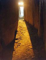
I have learned that the use of color can decide the theme and idea of an object, space, building, or place. The use of different colors and color schemes will change the room completely. As I was picking which felt to lay my building model on (in class light and color exercise) it took a minute or so to find the right color because each one gave my building different vibes. Light can set the mood of these four focuses in our interiors class. What light can also do is play a role in representing something greater than expected; adding meaning and life to things. It can be used to bring emphasis to an object or area; it can brighten up a room and give it the feel that the designer wanted. I chose the picture of New Grange below because of the way the light tunnel depicts light itself. It treats the sun as a rare being because it only seen through this tunnel before, during, and after the winter solstice. The chair represents the scale of our brain to art. This artwork helps us to grasp and understand how the psychotic brain functions in a visual, tangible form because of the way the artist used color to depict thoughts. We see the use of color in materials in my case study building, the Lever House, through the green and blue hues of the glass. Light plays a role on the same building by casting a shadow in different directions as seen in my case study 4 assignment. I think that all designs can be described by light and colors. For example if you walked into and all white room you can say, "all white-neutral." A pitch black room can be describes as "no light" but that is still using light to describe the space.


Tuesday, November 17, 2015

Case Study 4: Light and Color

 My building of course is the Lever House in New York City. This is a perfect example of how light is reflected off of spandrel and transparent glass and how the shadow of the building is cast. In the first four photos I used a flashlight to represent the movement of the sun. You can see how the shadow of the vertical building is highly affected by the light where as the horizontal building's shadow still moves but not as far because of its height. The shadow gets longer as the light goes up and as it goes down, but when the light is hovering over the model (2nd photo) the shadow gets compressed. The chrome duck tape represents the glass of the Lever House; It has a similar reflective quality. I would imagine as cars drive by, one would be able to see the reflection of the cars in the windows. Artificial light can bend and stretch as it is reflected upon this building. As far as the color goes it does not change much except for the fact that the green area gets darker or lighter depending on where the sun is. When the sun is down it is a dark building and when it is out the building is light green/blue because the glass is lit up. The last photo (bottom) taken was with natural light only (no flashlight). I wanted to mimic the effect of a cloudy day where we virtually never see the sun. As you can tell the shadow is extremely hard to see, making it nearly invisible.


"A shadow is cast / over the fast city streets / the sun is present"

- Ryan Gates -

Sunday, November 15, 2015

A Visual Essay: UK Art Museum


Light and color are interesting concepts that are incorporated in our everyday lives. I went to the Art Museum at The University of Kentucky to see how these concepts are interpreted into art. The artworks had their own unique style and personality which was very intreginig. Below each picture and to the right is the accompanying text.

This statue represents an African slave that has her arms roped behind her while she stares hopelessly. The light emphasizes her beauty but it also brings out the tortured emotions within her. Black is used on this sculpture to represent the dull, mute, and brutal life of the slaves. The color can also represent the ethnic background of this woman.


Here we see another minority but looked at in a different view. This artist added color and life to this piece. It was inspired by the people in the South Bronx. The light brings out the facial expressions of this egar to learn school boy. I think it is important to show both the slave side and the free side of this culture which is why I chose these first two pieces.


It is obvious that color is a huge factor in this work of art. The idea of this is a representation of the low income citizens of Jamaica that usually go unnoticed and because of this the people struggle with their place in society. The contrasting colors and designs on the coffins represent each unique quality in every person because no-one is exactly like another. "You may not have noticed me when I was alive, but you will damn well see me as I leave."


I chose this particular piece because of the way the light brings out each color. The words that come to mind when I look at it are vibrant, radiant, and creative. My interpretation of the artwork is a child's imagination free flowing.


The bottom column stump is a neutral and boring grey color because it emphasizes the chaotic life of central London. The top base is an exact replica of the bottom except flipped overs and it is special because it uses a crystal, translucent color. As the light shines down into the piece it glows and has ice cube like qualities. The artist wanted to create Central London (bottom) but wanted to create art that is worth while which is why the top half is there. 


The chair above is my favorite work in the museum. What the artist did was take psychological attributes of the brain and turn them into art. The various colors on the right side of the chair represent our vibrant creativity as humans (right side of the brain). The left side represents the other side of our brain that we associate with logic, numbers, and science. There is also a scary side to this chair that the colors represent. The various rainbow colors show the fun loving side of a psychedelic experience but as we go to the other side it show the dark and ominous places in our minds. Is the artist using colors to express a split personally?


In his picture we see the past and present come to life to form one. The black and white images are from the past and represent the creation of the roadway. The background image is colorful and represent the current era of that picture and the use of the road way that was being built in the first two images I talked about.


I chose the painting about because it emphasizes both light and color in nature. The sun is rising over this valley and we can see the shadows disappearing as the sun illuminates the valley.


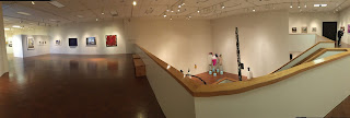
The museum its self was a work of art in itself. It was split up into exhibits that had their own meaning as seen in the photos below. I liked the use of neutral colors in the brown flooring and white walls. It gave the art work more of an emphasis. The lights hung in a way so that almost each of work art had its own spot light which illuminated them.


The photo above shows a panorama of the second floor and part of the first. It will give you a better feel for how the space was constructed and how the designer brought this structure to life. Of course the real life of the museum comes from the artwork inside.

Tuesday, November 10, 2015

Newman, Singletary, SAVS

Inside of the Newman center we saw light play many different roles. The room of worship had 2 skylights that beamed in natural sunlight. There was artificial light used to draw attention to the podium, the various pieces of art, and the baptistry. We saw a cream colored theme within the interior and as the light hit the walls it brought out the texture on them. The Singletary center used the idea that the people inside of the structure are what matters the most. Red was incorporated throughout the interior. The artificial light on the east wing illuminated the wall and brought the texture out in the bricks. It was fascinating to see the bends and curves that the brick made. On the west wing there was a skylight that brought in natural light because this side was made to look at and ponder. We see different works of art on the wall. Inside the walls of the SAVS there are many different interior designs. One wall shoots out and then in as if there are hills on the wall. The green paint brings out the light within the building. Each piece is unique to itself. The skylights let in natural light that brings out the green paints and the natural florescent light mimics a natural light.

Sunday, November 8, 2015

Loudon House

The here and now section of the exhibit was my favorite of all. What I most enjoyed was that these pieces of art are unlike anything I have seen before. My most favorite piece in the display is Daniel Graham's "The Inaugural Meeting of Strangers in a Foreign Land." It tells the story of two complete strangers meeting for the first time and they realize that they share similar qualities. "For it is only through the act of traveling with no sails or oars that we see our inheritance reflect into our actions and in turn see the work of God in what we do." As the light shines upon the boats it draws an emphasis on the dark maple wood pieces on the inside. I believe the artist wanted the light to reflect this way because it is what is on the inside of us that counts. As you can see the light is meant to illuminate this artwork so one can see it for how it is.

My mind was free flowing while I was walking around the Loudon House. It is a Gothic-styled home with wooden floors. There were eight rooms that I explored, each having its own unique vibe. The house itself has many windows with glass pane that allowed light to shed into the rooms. The light passed through, beaming onto the floors and walls. It looked like a movie set. The natural light lit up the room very well and the artificial light that was added to the rooms illuminated the pieces on the walls and really emphasized "hey look at this artwork over here." The photo below illustrates what I mean in the previous statement.
This Castle type home is in a vey unique location. As the sun rises it hits the building directly with nothing in the way. The light glistens across the building as you can see in the panorama below. When the sun hits it the widows cast shadows across the building. The light brings out the white in the building m making it look much more elegant than before. It also brings out the character and detail on the exterior. Emphasis is placed on the entire building because of the way it glows.


The visit to Castlewood park was interesting to say the least. It was surrounded by poverty stricken neighborhoods but the area of Castlewood seemed to have a happy spirit. There was a nice park and playground that had children playing on it as I visited. The Loudoun House was different because it was a self guided tour. I found out that each person has their own personal experience as they travel throughout the home. Where in other homes we have toured have had a tour guide that guided our thoughts and feelings. Lexington is an extremely important city in terms of design and the United States history. The designers that have created buildings, only miles away, that are so significant to design show us how important Lexington really is. I believe that Ashland was the best house I have visited so far. It is an extremely personal home to the Clay family. Each home tells us a story of what the designer was thinking as they went to work on the home. It can give us insight on the families that live inside them. The light can help us understand the "feel" of the building.

Friday, November 6, 2015

Campus Building (light and color)

When light is reflected upon the nursing building we see the light bring out the top half of the building. It reflects off of the windows and brings emphasis to that area. The bottom portion of the building is brick and the shadows make it even darker. When the trees are grown the sunlight produces a shadow of them on the building.

Unit Summary 3 (materials)


Materials play an important role in design. The concrete encounter help me grasp the idea of materials. They help us understand what the designer is thinking while he or she is putting the object, space, building, or place together. The question that come to my mind in this unit, "What isn't made of materials?" Whatever the object, space, building, or place is made out of is material. The Pyramids of Giza used to have white limestone on the exterior and a gold cap on the top. The scale of the limestone was significantly larger than the cap. They did it this was because it represents power, and the all seeing, which was only for few. The principles and elements of design we learned about in unit 1 go hand in hand with each other. Various materials are put together to create a structure; Then the materials reflect a principle or element. The emphasis on the glass  and the contrasting nature of the Lever House is a good example. Scale and materials can also go together as shown in my example above of the pyramids. I do not believe that designs can be fully analyzed and describes be the materials but I think it can focus our thoughts on a concept for the design.

The picture below is the Pyramids when they were layered in limestone and had the golden cap.


The picture below is the Lever House, Look at the way the brick contrasts the two structures.


The last picture is of the concrete encounter which helped me get a sense of materials and how they work.d


Monday, November 2, 2015

Light + color 1


New grange is the most well known passage tomb in Ireland that dates back to 3200 BC. The tomb held many deceased loved ones of the era. Throughout New grange are passage ways that led to the tomb. These passage ways had markings on them that are said to be faces that I believe tell a story of the ones that were laid there. During the winter solstice, and days before and after, light glistens into the passage ways through a small opening as shown in the photo below. In Neolithic culture the winter solstice means a rebirth of nature and life. As the light shines down through this small opening and into the passage ways it not only illuminates the carvings on the walls but I believe it serves as a spiritual guidance that gives a new life to the ones laid to rest at New grange. It gives us all hope that there is a life after death.

Canstruction

           The materials we used were soup cans that were mostly the same size with one or two that were a little bigger and a little smaller than average. At first we tested to see if we could set the can on their sides but they rolled around too much. The flat base of the cans allowed us to stack them high. The first photo is of our small group's design. We were going for a pyramid but I see a Greek temple when I look at it. The bottom cans represent columns and the top three represent the top of the temple. As a whole we decided to build the Pyramids of Giza (second photo below) because we could provide depth and volume as well as represent all three structures. The activity taught me that if you combine different materials you can produce something greater than if you were to use one type of material. 


Above is our interpretation of a light fixture made out of soup cans.

Thursday, October 29, 2015

21st Century

The ideas that are coming out of the 21st century have a creative spark to them. I love the idea of taking an old space and turning it into a new one and using it for a totally different purpose than its intended use. It has been a dream of mine to live in an old building in a big city that has been renovated into a condo with rustic brick walls and tall ceilings. My whole life I have considered myself as a sort of visionary and that I could see and grasp spaces different than most but I could never really explain it. It was cool to see that technology help create these complex spaces and turn them into a drawing on the computer. I was shocked to see the percentages of materials that are put into buildings. It made it more real to actually see a physical percentage. I am a outdoors person; skiing, hiking, wake boarding , you name it. Biophilic designs speak to me in a way because of my bond with nature. It is cool to see how us humans can start a process for nature and then nature completely takes over and turn into a mature form.

Wednesday, October 21, 2015

Concrete Encounter


For this exercise we were told to bring a jewelry box, rubber glove, or a can and ballon; I chose a jewelry box. As a group we mixed together 4 cups of concrete mix and 1 cup of water. Once we mixed it together we poured it into each of our boxes and added our own personal touches to them. After my box dried I pealed the cardboard off around the concrete and it formed an 8x4x1 inch box (coaster).
This activity was interesting to me because I got to see how this material comes together and forms from the bag, a powder, to a hard block. We had several issues making our mixture thick enough to pour. If the mix was runny, then we need to get more mix. There are many similarities with my creation and the creation of the mud brick. Each form uses a material and mixes together with water to form its hard shape as it dries in the sun. Concrete was first formed from volcano ash which is similar to the powder that is in the concrete mix. We see this material take on three forms over a span of 24 hours. First in the powder form, then in the liquid form for pouring, and lastly in a strong solid form. 

The image to the left shows the concrete drying at about 18 hours.


                                                                       The final product

Creating our masterpeices 


Friday, October 16, 2015

Unit Summary 2

This unit of our class has broadened my views on design as a whole. I did not recognize the concept of scale until then. Scale can be portrayed in many fashions and each designer has his or her own perspective. The scale helps us compare or contrast what is being shown to us. We see different sizes and shapes representing that. As we looked at the chairs in class I pondered the idea of how people think and what makes them say “this is what I have made because…,” and so on about scale. Most of design is opinionated art work with guidelines. The scale shows us new viewpoints about objects and space; and how they interact. It is important that the scale is appealing to the eye and will stick out in our mind. The scale is not like any other principle we see in unit 1 because it involves so much more than just what is on paper. Scale can be an art form in itself. Any design ever constructed can be out to scale and tell us something about it; It can paint an image for us. 

The image below shows us a large open room that shares a table and a couch with a fire place, but we see the break in the wall that obviously divides this large room into two sections, or separate open rooms. (Dining room and Living room)

In the photo above we see the inside of a castle where elegancy and beauty reside. There is immense detail put into each piece of the room to help show scale.


Thursday, October 15, 2015

Material Thoughts

We see materials playing a role in today's and yesterday's societies. We saw that the hut derived from fires. The people of that time wanted to bring the warmth of fire with them, so they created this warm room that they called a hut. These huts made the people of that time competitive and innovative. This is how we start to further in "technology" and efficiency. These increases in technology succeeded through the stone age and so on. Things of nature are turned into everyday materials. We see the idea of stone and brick still heavily used in society today. The idea that material  can express emotion but rhythm and texture powerful. The hieroglyphs show us stories with texture and detail; it can bring emotions out of us. In the picture below (The Lever House) we see both structures of the whole standing up on stilts or columns. The material of concrete (columns) represent a subtle feeling of power because its a little above everyone else; that is how I see it.

Tuesday, October 13, 2015

Chairs

After looking at the chairs my sense of modern did not really change, but it more came together and made sense. In modern looks we see odd or opposite sides shapes come together to form a new looking version of a normal object. I have had a problem understanding scale for quite sometime and seeing the chairs helped understand that concept. The chair with the tall back is what stood out to me when I think of scale.

Friday, October 9, 2015

Case Study 2

The Lever House is a transparent building (all glass) made of many different flat surfaces. I tried to make the surfaces stand out in the rendering above so that the viewer could understand what the designer was trying to do. The designer used vertical bands of windows on the horizontal building and contrasting used horizontal bands of windows on the vertical building.We see an emphasis on the corner of the tall building where the two horizontal walls come together. You could scale it and say it looks like a giant chair for a giant company.